all images copyright Daniel Jackson, courtesy PSM gallery and the artist
Born in 1972, Daniel Jackson grew up in Texas, where he enjoyed punk rock records, captured his surroundings with his camera and bought lifestyle magazines that sparked his curiosity in big cities and in the arts. In New York, where Daniel took a MFA in painting and lived for seven years, he began developing an aesthetic language dedicated to the discovery of seemingly unspectacular moments and gestures in everyday life. Terrified by the attacks of 9/11, a former girlfriend brought the artist to Germany, where he would eventually settle in Berlin.
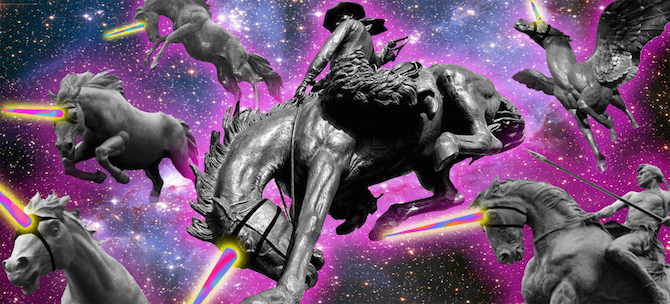
Daniel pursues an experimental artistic practice using various media. He applies techniques from painting, printing, sculpting, photography, and video art. The Berlin based artist is influenced by social media aesthetics, elements of design and, in particular, by science fiction, while also confronting himself with existential themes, such as the fear of failure. I talked to the artist about his his inspiration, the discovery of patterns and boredom in Texas.
Anna-Lena Werner: Daniel, you work in various media. Which role do videos play for your practice?
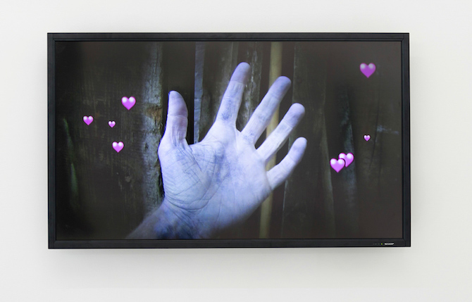
Daniel Jackson: They’re becoming more important for me. In my last show, the videos were short loops, like gifs from social media. My favorite video from the show is a reference to a scene in Blade Runner: Roy, the main cyborg, knows that he is going to die, but he doesn't know how much time he's got left. His arm and hand are cramping up, and suddenly relaxing again, while he says "Time enough…". I copied the scene, and added these goofy digital hearts coming out of the hand.
ALW: Your videos, like the music clip "King Tut" (2012), often borrow elements known from science fiction movies. Why are you interested in this particular aesthetic?
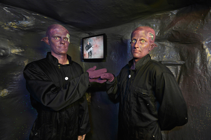
DJ: I'm interested in different ways the future was imagined throughout science fiction history. In the 60s it was all about colonizing space and meeting space aliens, while in the 80s everyone thought we were going to be in space, having a super awesome future, driven by the construction of the international space stations. Today, our view on the future is very pessimistic, but there is also an urge to change something.
"King Tut" was my attempt to remake a music video by Paul Hartcastle. He spins in, playing a synthesizer and has all this NASA footage in the background. I built a green screen in my studio and assembled all the material together from footage available online.
ALW: What triggered your interest in science fiction initially?
DJ: When I was a kid, I read many science fiction books from authors like Ray Bradbury, George Orwell, Philip K. Dick or Octavia Butler. For a while I was really obsessed with these ideas about the future. At the time the idea of the future was seen more positively and there was an effort to educate the masses about scientific ideas. I’m referring here to television shows, such as Cosmos by Carl Sagan. I was always personally drawn to the more dystopian side of the genre, though.
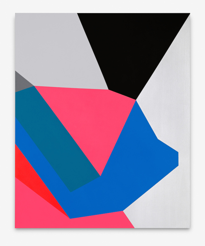
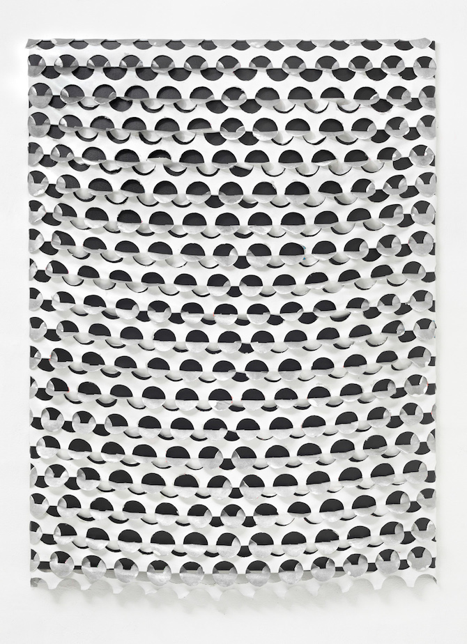
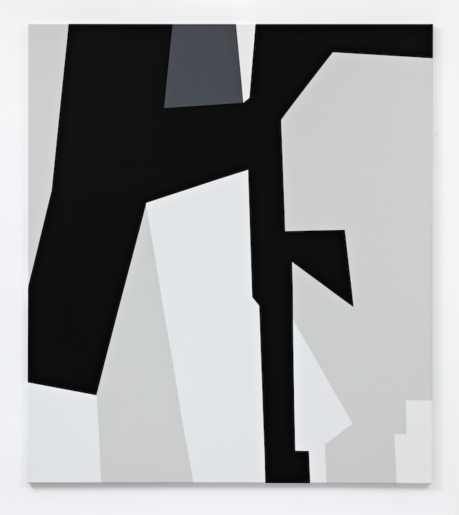
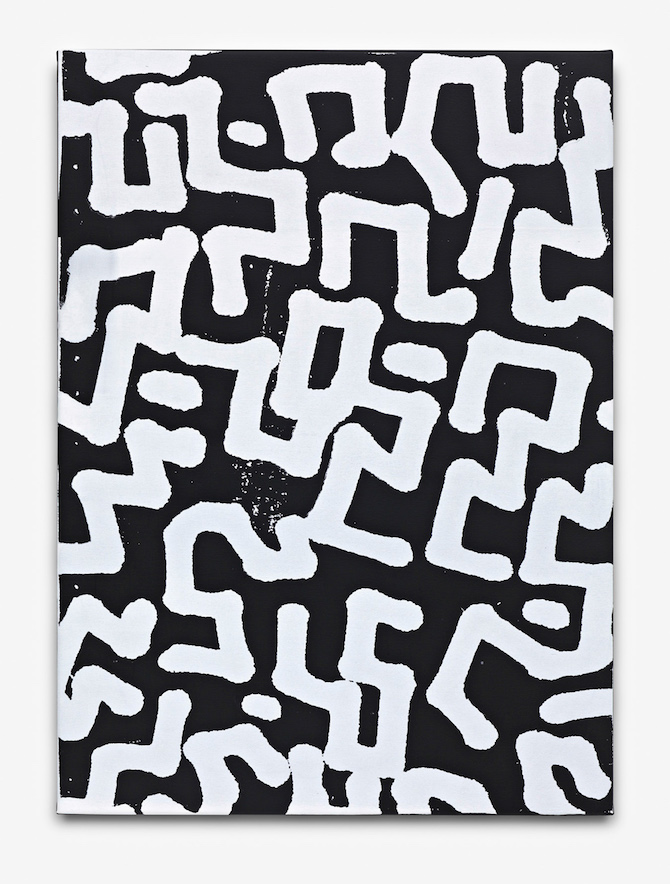
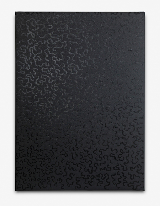
ALW: Your paintings have a unique graphical aesthetic and structure, which reappears in a silk-screen print that you made as an edition for DRAW A LINE. How is its pattern related to the rest of your work?
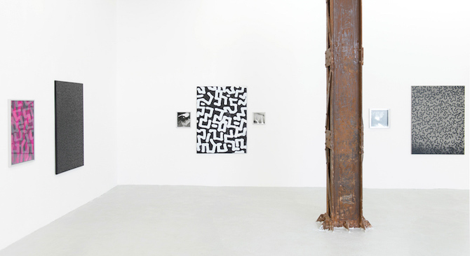
DJ: It's related to paintings with high-contrast colors and clean lines that I began about five years ago. They reference a pattern called dazzle: Some impressionist artists had originally developed it during the First World War, where it was intended to disguise boats. At that time they didn't have camouflage and they realized pretty quickly that you couldn’t hide a boat in the ocean, so they came up with these patterns that would confuse the speed of the ship and the direction it was going. I took it from there and made my own. It was a way of reducing the painting as much as possible and keeping a tension in the design.
ALW: Did you just stumble across this particular part of history?
DJ: Yes, basically. I swear, I am not a military nerd, sitting around and reading World War II books. Also, the paintings were related to my first solo show at PSM and it's theme.
ALW: In your recent works the patterns became more minimalist. Why did you choose to reduce forms and gestures?
DJ: They started out as doodles, coming out of an idea of developing a camouflage system on my own. I would sketch them in my studio and then blow them up, until they were totally abstract. I’m a big fan of the Memphis designs and at one point I saw that Ettore Sottsass, the main designer from the group, had designed a similar pattern for a kitchen laminate. He called it "Bacterio". They also look a bit like Keith Hearing doodles, which as a kid of the 80s, I saw all over the place. I'm sure it was burned into my memory.
ALW: Their form reminds me of graffiti tags. Did you ever take part in this subculture?
DJ: Not really. I didn't spray, but I did street art. I would make things in Photoshop, print them on paper and paste them onto walls. For me, it had the same effect that Instagram has nowadays: within a few minutes more people would see the work than those who actually visited my show in an art gallery.
ALW: A re-occurring theme in your work is the fear of failure. How can you make it productive for yourself?
DJ: By addressing it directly. Once I did a figurative work depicting a guy who pushes a shopping cart that is filled with his record collection. It started out as a joke, like: I will end up homeless, but at least I have my record collection. It was my worst fear. In this sense, I am working with the notion of fear rather than of failure. This piece was also reference to Cormac McCarthy's "The Road".
ALW: …another dystopian novel. Do you think that there is still space for optimism?
DJ: I am actually a lot goofier and positive than it would seem on the surface.
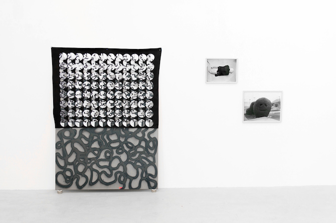
ALW: Your last exhibition at PSM included many black and white photographs from your personal archive. What is it that makes photography so exciting for you?
DJ: Growing up in Texas was kind of boring. Magazine photos were the only access I had to another world. They had this magical quality of showing me something that didn't exist in my world: bands, New York, freaks, foreign places, art.
ALW: What do photos mean to you today?
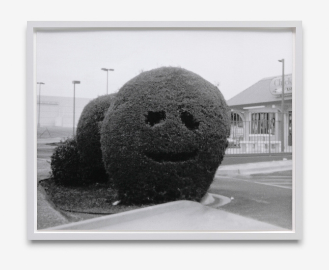
DJ: I have lots of photos with emotions attached to them. Photos capture these special moments. There is an anonymity to them that becomes something really beautiful. In a way, it's like the graffiti that is everywhere – something might pop out at you, even something unspectacular. One of my pictures, for example, shows a bush outside a fast food restaurant in Texas. Someone had just carved a smiling face into it. I took that photo when I was about fifteen.
ALW: Did you recently rediscover it, or waited for the right moment to show it?
DJ: I actually did wait all those years. I just had to figure out the right context.
ALW: Your last exhibition claimed not to give any answers. It seemed more like a collage of thoughts. How do you approach and develop a specific subject for an exhibition?
DJ: Previously there was always a specific idea or a theme, all held together very tightly. But last time I really wanted people to come in and to think about it. I was more concerned with these small gestures, like the graffiti or little videos you might run across online. It was about being open and creating an aesthetic juxtaposition between different media, not necessarily suggesting that each of the works would make sense together.
ALW: Does being open imply allowing an error to happen?
DJ: Maybe not an error, but an imprecision.
This interview has originally been published on drawaline.de
Daniel Jackson is represented by psm-gallery.com
Daniel Jackson is represented by psm-gallery.com
all images copyright Daniel Jackson, courtesy PSM gallery and the artist, the edition courtesy DRAW A LINE and PSM
