20 October 2012

LONDON: FRIEZE ART FAIR #2 - BEST OF THE REST

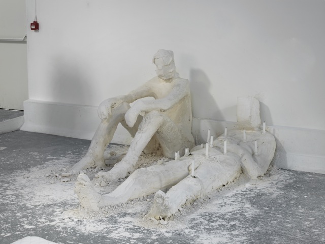
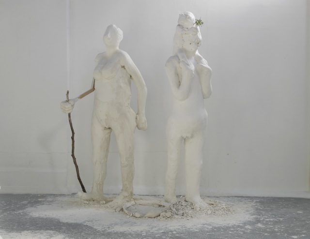
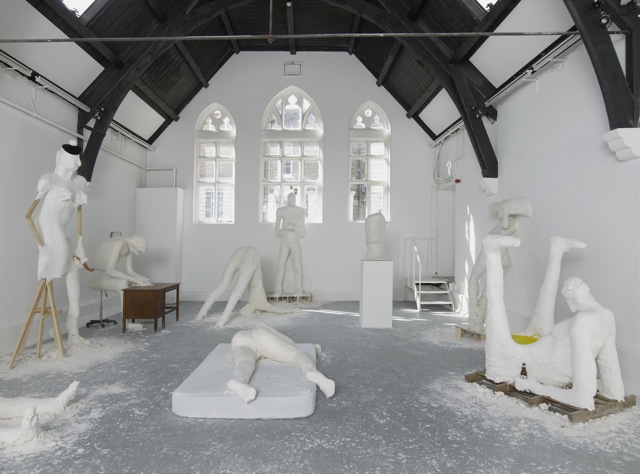
Nicole Eisenman - installation view at Studio Voltaire 2Nicole Eisenman - installation view at Studio Voltaire 1 Nicole Eisenman - installation view at Studio Voltaire 4 DOI 163 DOIG 159
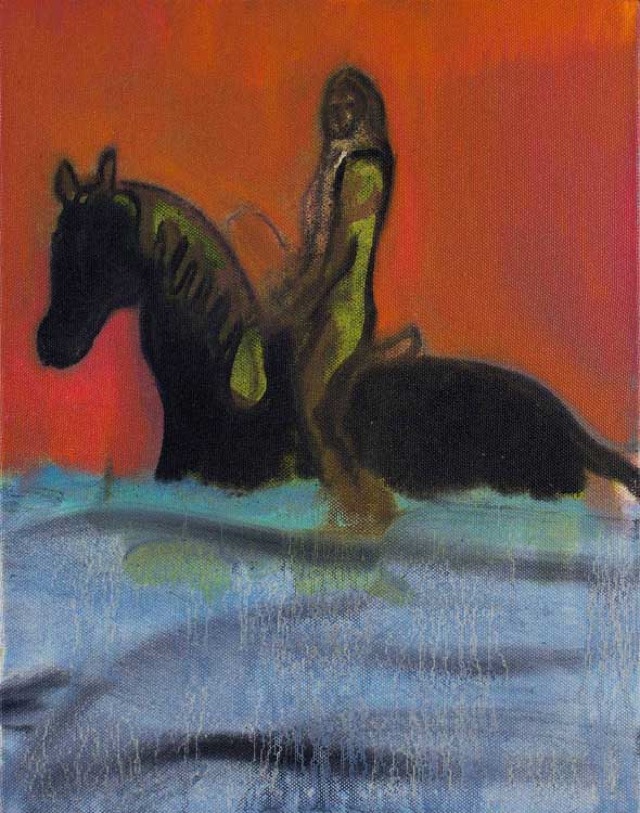
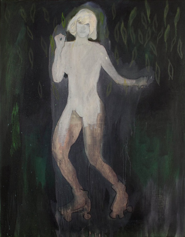
From the top: Image 1-3: installation by Nicole Eisenman, courtesy the artist and Galerie Barbara Weiss, Berlin; Leo Koenig Inc., New York and Susanne Vielmetter, Los Angeles; Image 4-5: Peter Doig “Riding in Water (Red)”, 2012 and “Fall in New York (Central Park)”, 2002-2012, Courtesy Michael Werner Gallery, New York and London


So the big tops have come down and the Frieze circus is over for another year. However, lasts week’s dizzying programme included many openings, private views and events at more permanent spaces, which remain open and are highly recommended. 

As well as having put on a lovely spread for Friday’s brunch view, Clapham’s Studio Voltaire bring together two female artists exploring the erotic charge of the human body through very different media in their current double show. Created during a month-long residency at the gallery, Nicole Eisenman’s large-scale plaster sculptures are the long, liquid-limbed cousins of the bulbous faces that inhabit her most recent paintings and prints. Limber and expressive, they hunch, fold, bend and slump against the gallery’s walls and floor, which are splattered with chalky smudges of dried plaster. Next door, a looped YouTube clip in which a pair of trainered feet scuff and scrape in a stylised game of footsie with the flinty ground plays on one of two screens. A separate voiceover narration intersperses a description of the artist’s experience of watching an internet video of a man carving a hand axe with the semi-erotic comments left online beneath the trainer clip. Perverse but somehow seductive, Charlotte Prodger’s installation uses the trappings of 21st century consumer culture to tap into a potent sensibility of the properly ‘digital’ - hands and feet – and a primitive intermingling of violence and sexuality.

On the other side of town Peter Doig’s hazily tropical latest offerings at Michael Werner outshine their muted counterparts in Luc Tuymans on show at David Zwirner’s new Mayfair space, just up the road. Heavingly, muggily romantic, they share the sunlit pallete of Chris Ofili’s recent paintings, whilst still retaining the brooding, otherworldy atmopshere of Tuyman’s dark frames.

At Alan Cristea, lightness is all. In ceramicist Edmund de Waal’s installation, a thousand hours (2012), two glass vitrines are filled with an accumulation of 1000 hand-thrown porcelain vessels. The dry, ashy hues of unglazed clay, these slender tubes have mute, pale and timeless beauty.

12 October 2012

LONDON: FRIEZE ART FAIR #1

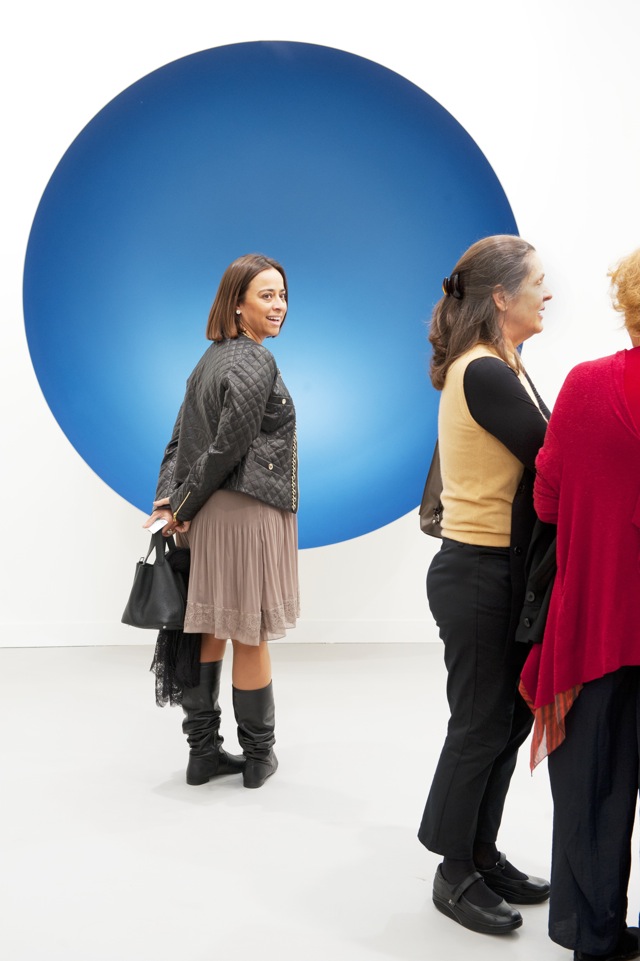
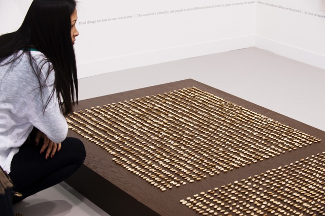
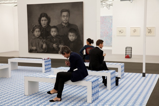
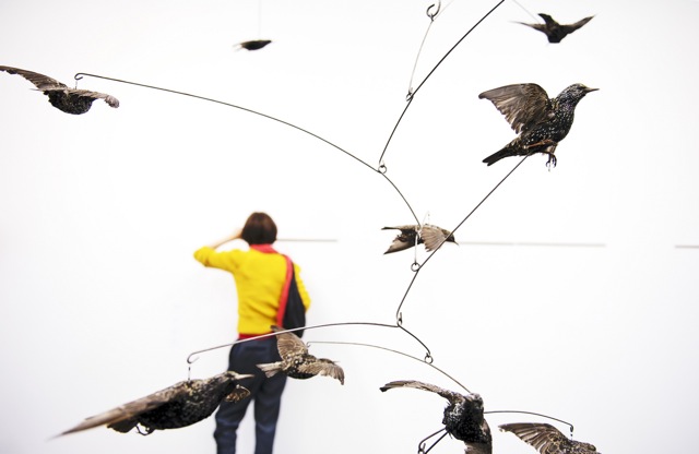
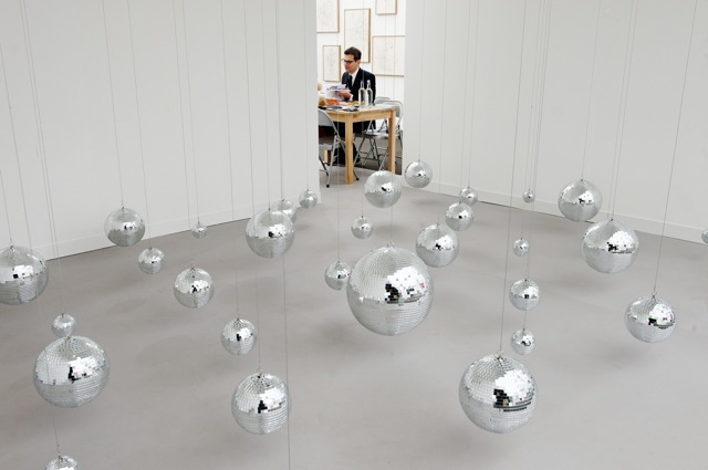
Valeska Soares, Galeria Fortes Vilaça, Sao Paulo Courtesy of Linda Nylind: © Frieze London Frieze London Courtesy of Linda Nylind: © Frieze London Anish Kapoor, Untitled (2012) Lisson Gallery, London Courtesy of Linda Nylind: © Frieze London Vitamin Creative Space - winner of the 2012 Frieze London Stand Prize Courtesy of Linda Nylind: © Frieze London Thomas Bayrle 'Sloping Loafers : Smooth' (2012)  Courtesy of Polly Braden: © Frieze London Henrik Hakansson, The Y Swarm (Sturnus Vulgaris) #2 (2011) Meyer Riegger, Berlin Courtesy of Linda Nylind: © Frieze London
from the top: Valeska Soares, Galeria Fortes Vilaça, Sao Paulo; Frieze London; Anish Kapoor, Untitled (2012) Lisson Gallery, London; Vitamin Creative Space - winner of the 2012 Frieze London Stand Prize; Thomas Bayrle 'Sloping Loafers : Smooth' (2012) Courtesy of Polly Braden; Henrik Hakansson, The Y Swarm (Sturnus Vulgaris) #2 (2011) Meyer Riegger Berlin; all images Courtesy of Linda Nylind and © Frieze London

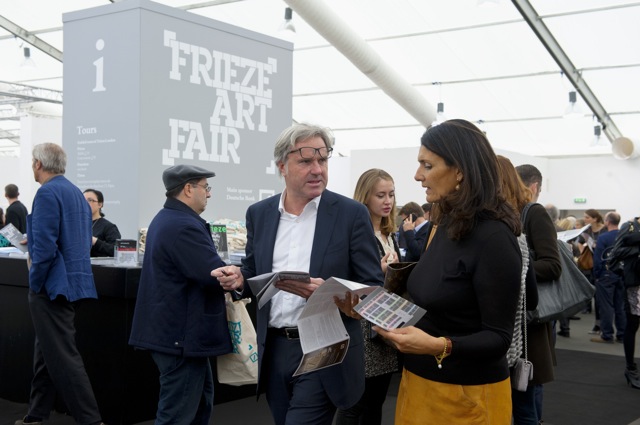
Frieze week started in earnest on Wednesday, with the vernissage of the 10th edition of the London fair opening its doors to the well-heeled of the world. In spite of the attendant peacockry and pageantry - the old refrain, ‘I don’t know what is more interesting to look at, the people or the art,’ got a good airing last night - the fair felt fresh and slick, and, as ever, it gives a decent overview of the notoriously slippery terrain of the contemporary art world. Or, at least, of what is being sold there, which is never quite the whole story. For example, it was interesting to note the relatively subdued presence of screen-based art. Especially since it feels as though film and video artists are currently running riot in London’s young art scene (witness ringleader Ed Atkin’s show at Chisenhale, the cavernous space dedicated to screen-based works in the V22 Young London exhibition and Hannah Sawtell’s just opened installation at the ICA, to take three very current examples). The installation of Ryan Trecartin’s sprawling and chaotic sculptural and multi-screen works at Andrea Rosen felt notably flattened by the tightly regimented, white-walled set-up of the fair booth. 

The exception to prove this particular rule was Elizabeth Price, shown as part of a three-artist presentation at MOT International. Her film, which appropriates the fetishistic and slightly sinister imagery and language of car advertising, shows why she is a hot tip for this year’s Turner prize.

There was far too much to take in on an evening largely concerned with shepherding wayward friends/awkwardly greeting vague acquaintances/procuring moderately but not outrageously expensive wine. For me, early stand-outs included two sets of painting of domestic interiors - both by male Americans; both very different. At David Kordansky, Jonas Wood’s large canvases were bright, flat and angular, whilst at the other end of the tent, Algus Greenspon’s stand was given over to the rippling, smoothly-folded pastels of Mathew Cerletty’s small-scale bedrooms. Elsewhere, at Salon 94, the accumulation of Matthias Merkel Hess’s glossily ceramic buckets, baskets and petrol cans impressed, as did Paul Kasmin’s solo presentation of works by William N. Copely. In these pieces, shown in a stand painted the bawdy stripes of the big-top, Copley’s trademark female figures, curvy and scandalously naked, are all the more titillating for having been cut out of mirrored Perspex.

More to come…

10 October 2012

BOOKS: BRINK MAGAZIN #2

brink magazin_ artfridge6 brink magazin_ artfridge7 brink magazin_ artfridge8 brink magazin_ artfridge2 brink magazin_ artfridge5 brink magazin_ artfridge1
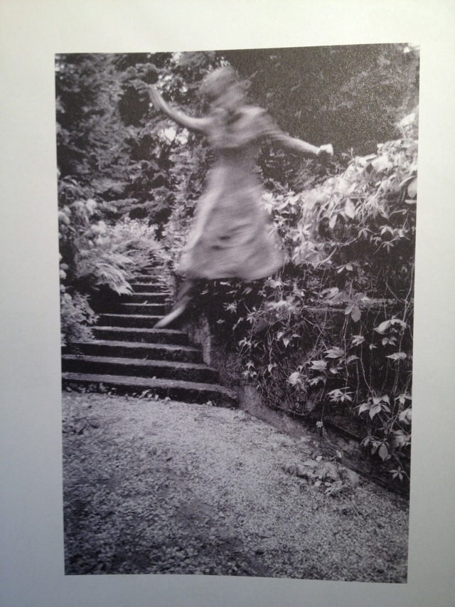
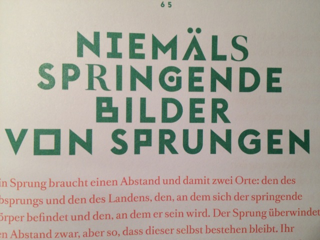
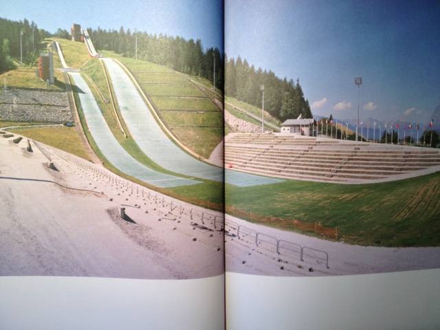
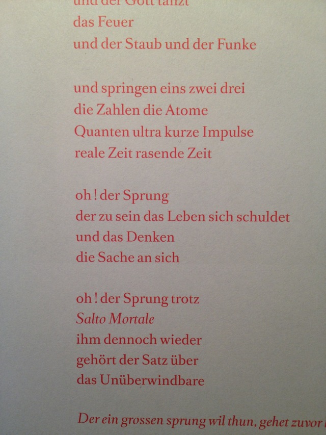
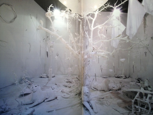
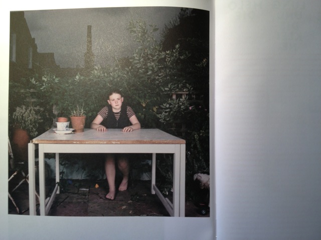
from the top: photography by Christina Lechner, text by Florian Sprenger, photography by Klaus Wefringhaus, poem by Jean-Luc Nancy and translation by Almut Pape, installation by Sarawut Chutiwongpeti and photography by Sarah Jones, images by artfridge, courtesy Brinkmagazin, the artists and authors

A jump is always a balancing act. In the case of the student-run brink magazin, it is a balance act between art and research. Theory and practice shall walk hand in hand, interdisciplinary and frank. In their second issue, which was released this year in June, the editors and artists concerned themselves with the phenomenon of the jump - the in-between, the before and the yet-to-come. It is treated quite delicately, such as if a jump was holy moment, a sort of sparkle in a never ending monotony.
Jonas Leonhard Tinuis, who wrote the introduction essay, skillfully ventures a dangerous path that leads him from poetry to science - to questions on anthropology and theatre, and eventually, on the freedom of writing an essay, the jumps that one may and should dare, including all the bridges, the metaphors. Another striking contribution is Florian Sprenger's interpretation of Christina Lechner's photography, understanding her dynamic jumping pictures as an attempt to grab hold on the ephemeral and pending interval.
The single-topic brink magazin provides 24 chapters on 74 pages, including many art works that elevate the texts' and interviews' interpretation on a much more visual level, putting it into new perspectives. The magazine's design is beautiful, in times a bit of an overkill of limitless design-freedom, which is, however, recompensed with a reasonable interaction of text, illustration and image. brink's second issue ultimately comments on its own concept: it discusses the balancing act of a jump, away from the ordinary  text - art - separation, into a curated, printed exhibition.
We already look forward to read the next issue!